Nomo Skincare
Packaging Design & Illustration
Branding
Photography
Live Brief
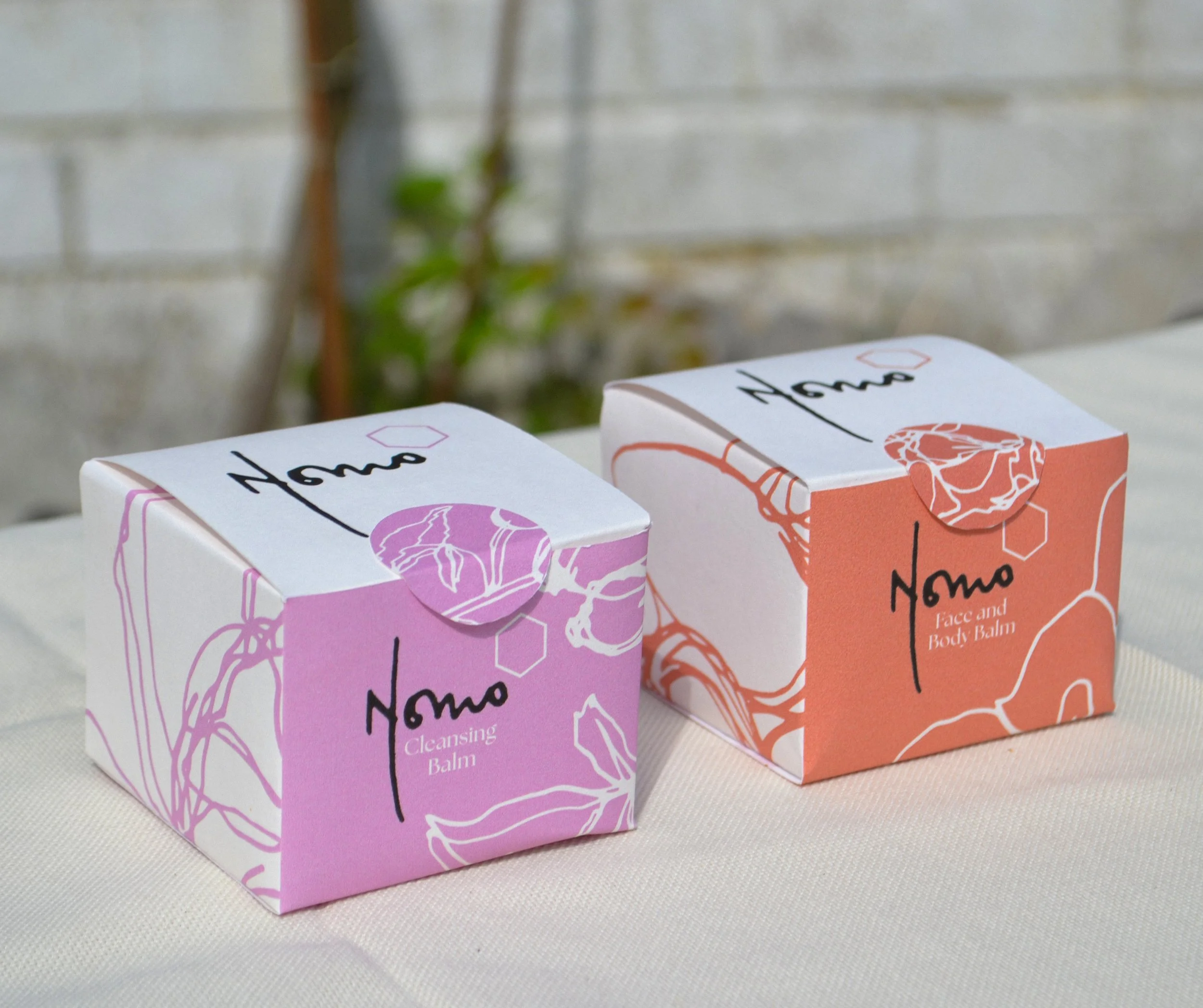
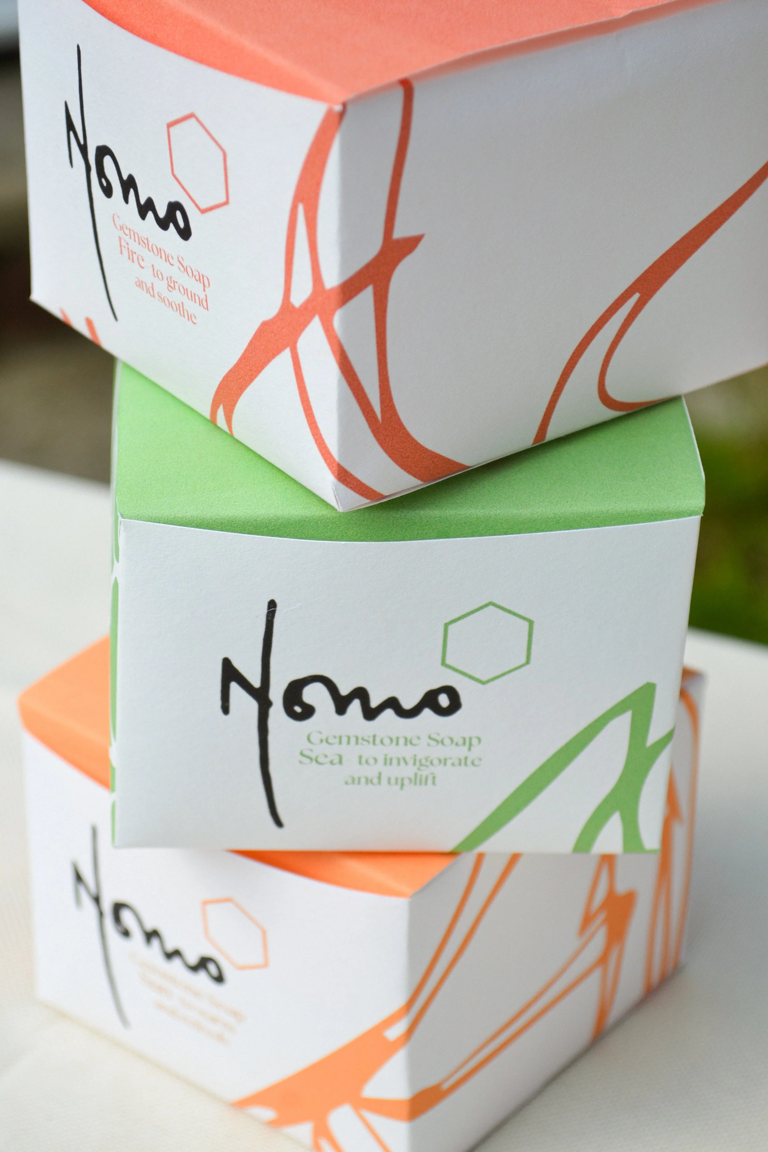
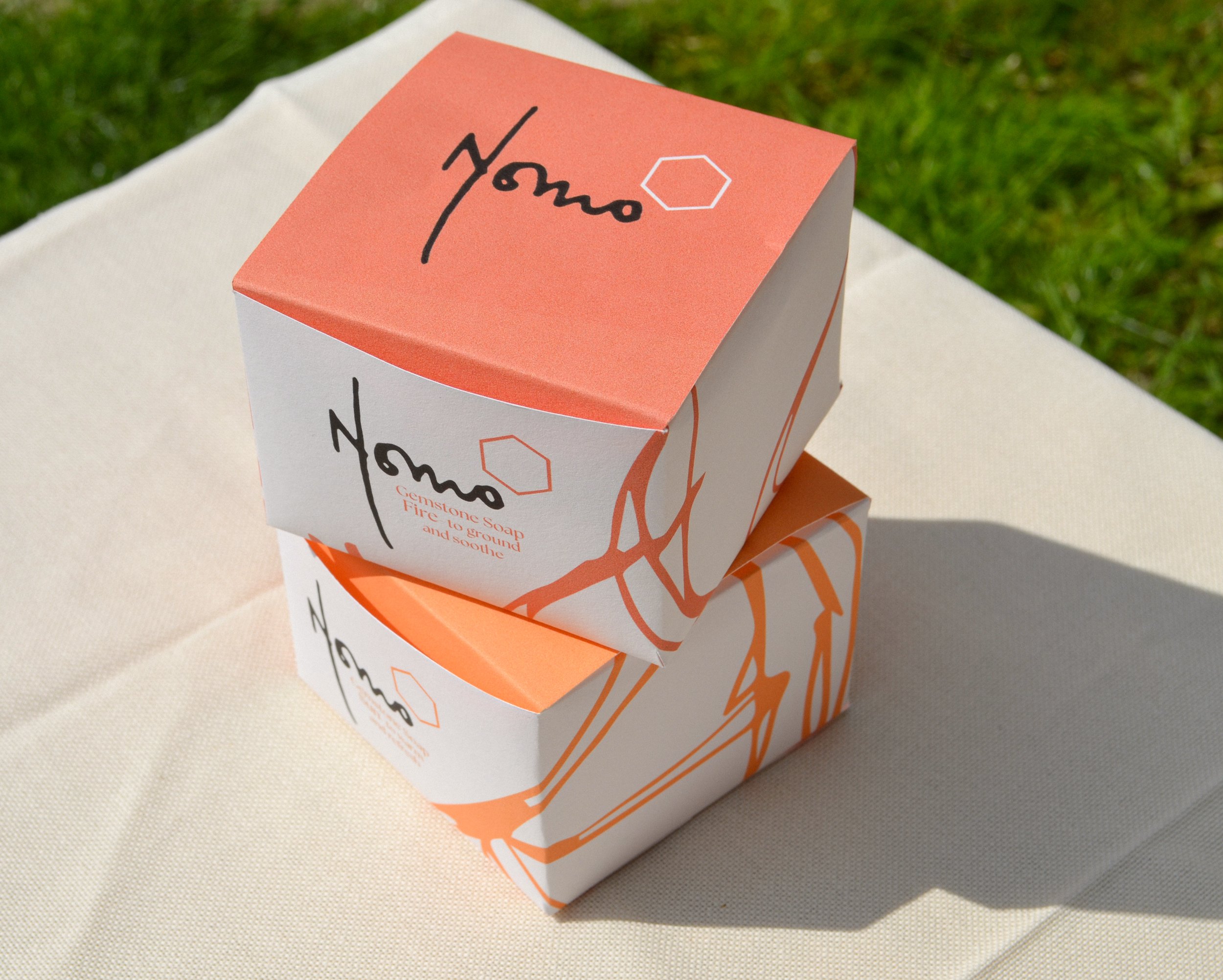
During my second year at University, I chose a live brief to design the packaging and visual identity for an existing skincare brand. ‘Nomo’ is a natural, sustainable company and upon meeting the client I discovered that the ingredients were at the heart of the brand.
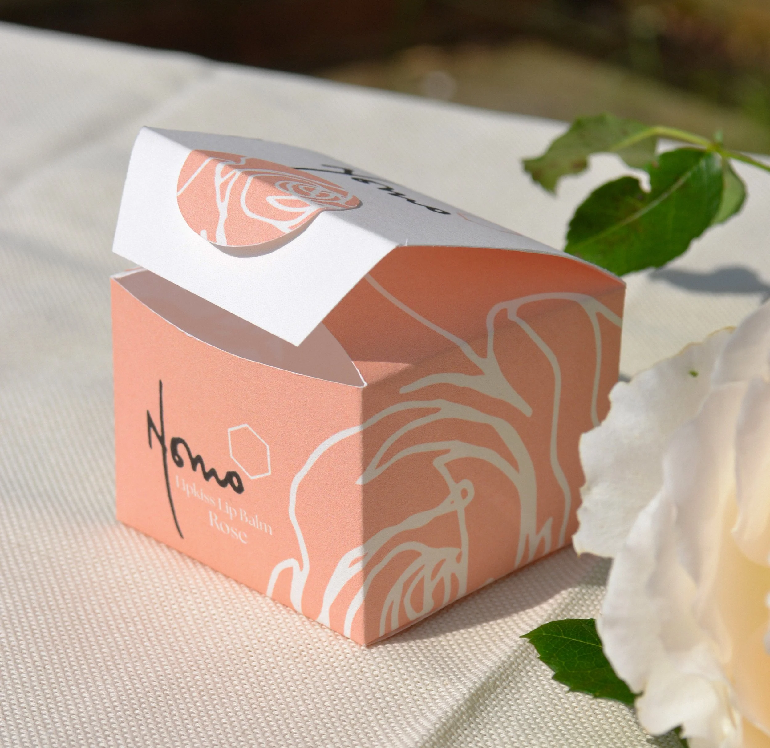
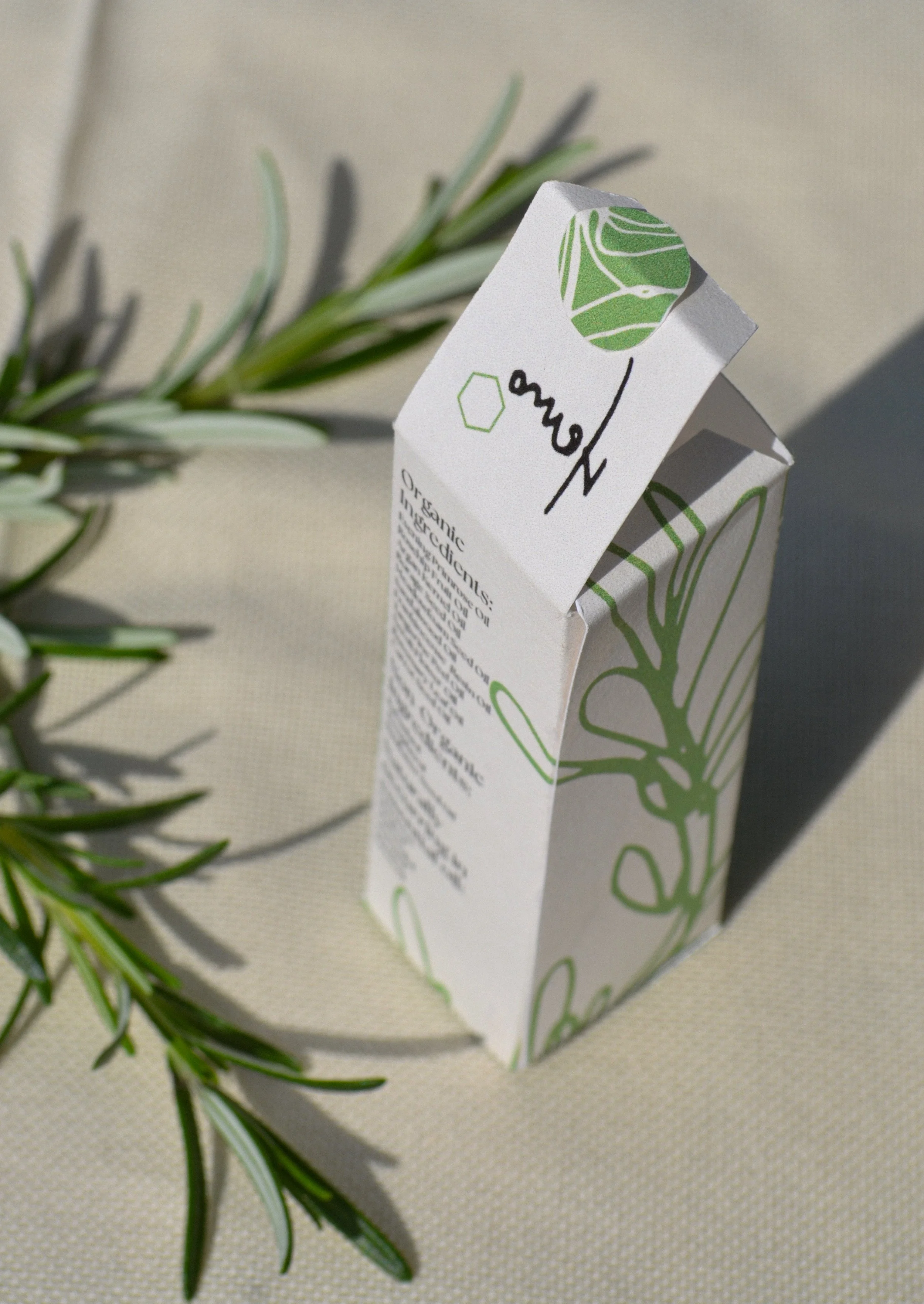
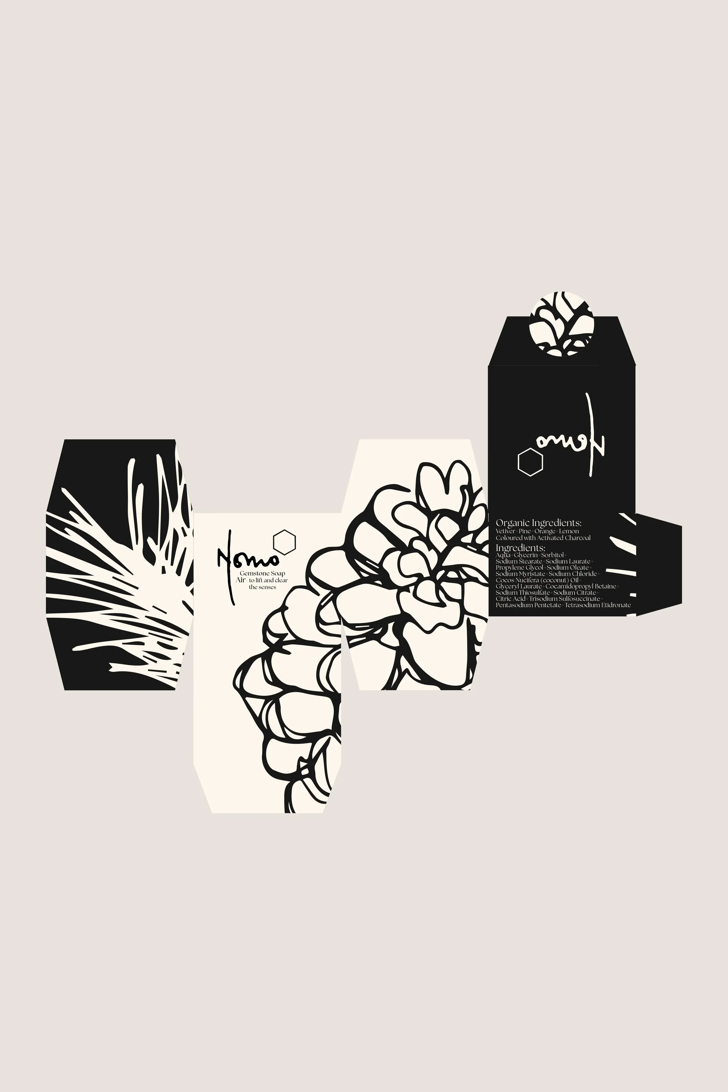
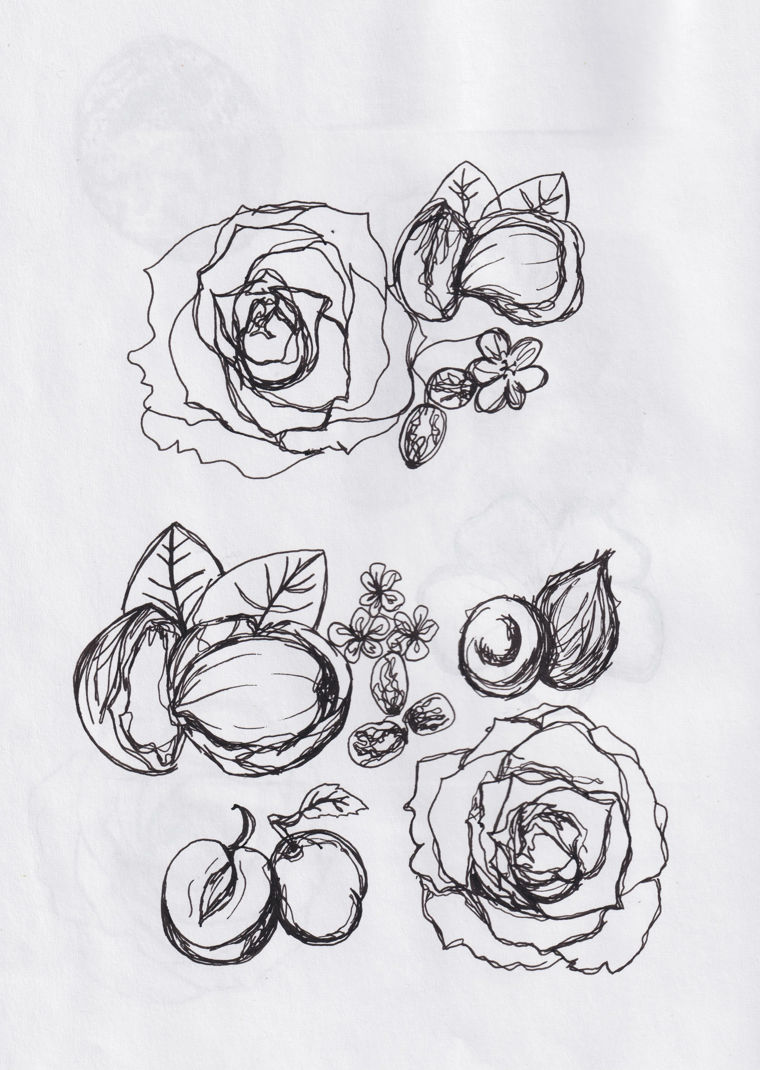
A challenge with this brief was to keep the original logo and work the designs around it. I created three routes which I presented to the client and from her feedback I expanded on my idea of illustrating the corresponding ingredients in a fluid, abstract approach to compliment the logo. I chose an elegant typeface for the packaging which was inspired by an insight from the client where we spoke about natural ingredients being a luxury. The colours were inspired by the product’s identities and ingredients, for example the rose balm packaging is a pale pink shade.
Once I was happy with the designs, I printed the packaging nets to present to the client. I was pleased with her reaction and through this project I discovered my flare for designing and illustrating packaging.